Disrupt & Delight
Rebranding BBMG for the next 10 years of mission-driven work
Client
BBMG
Industry
Brand & Innovation Consulting
Services
Brand strategy, verbal and visual identity, messaging, creative direction
Challenge
As BBMG approached its 10th anniversary, the consultancy it had become — bold, dimensional, systems-oriented — no longer matched the visual identity it had started with. How do you rebrand a branding agency? Carefully, and from the inside-out.
Solution
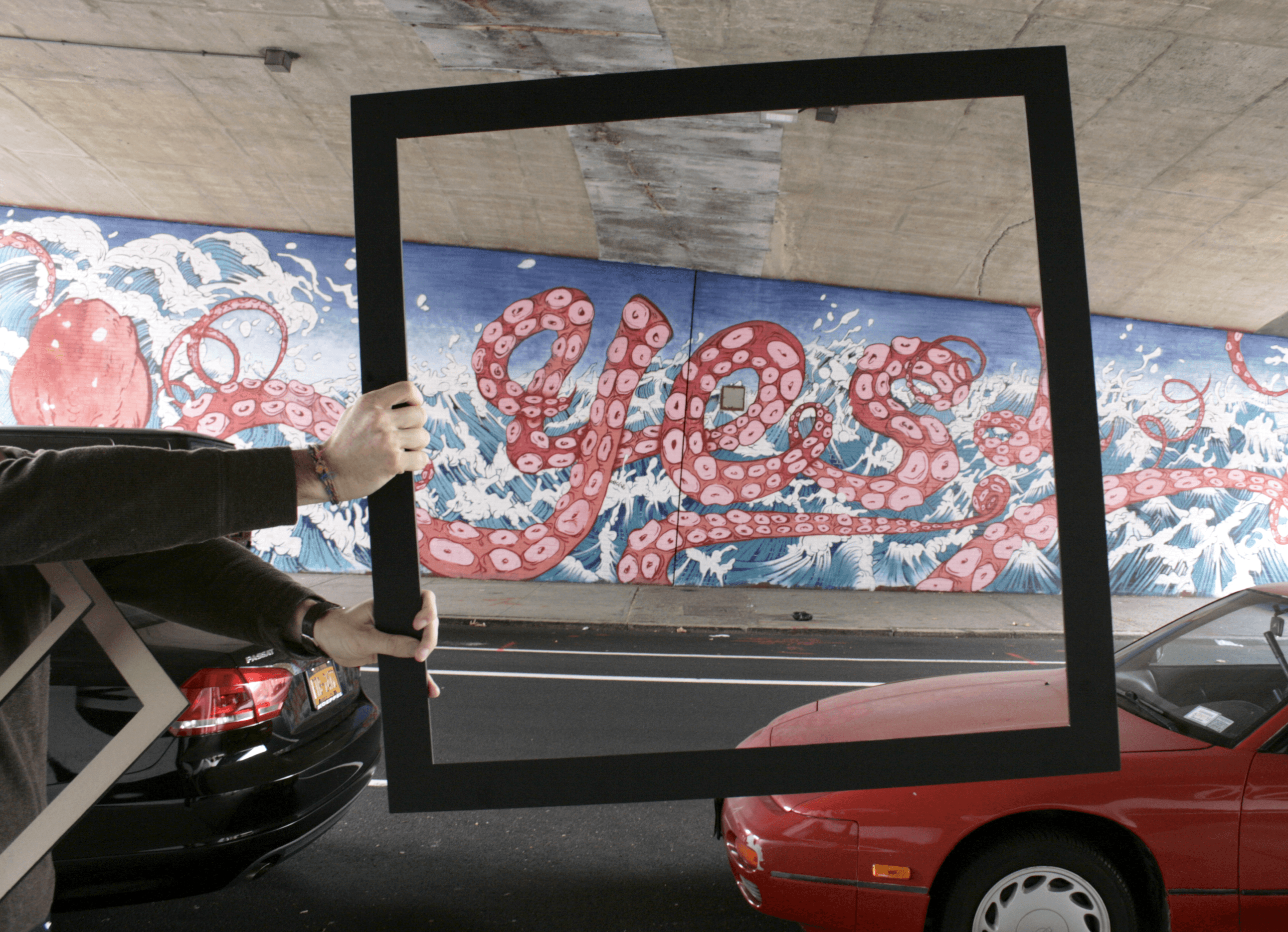
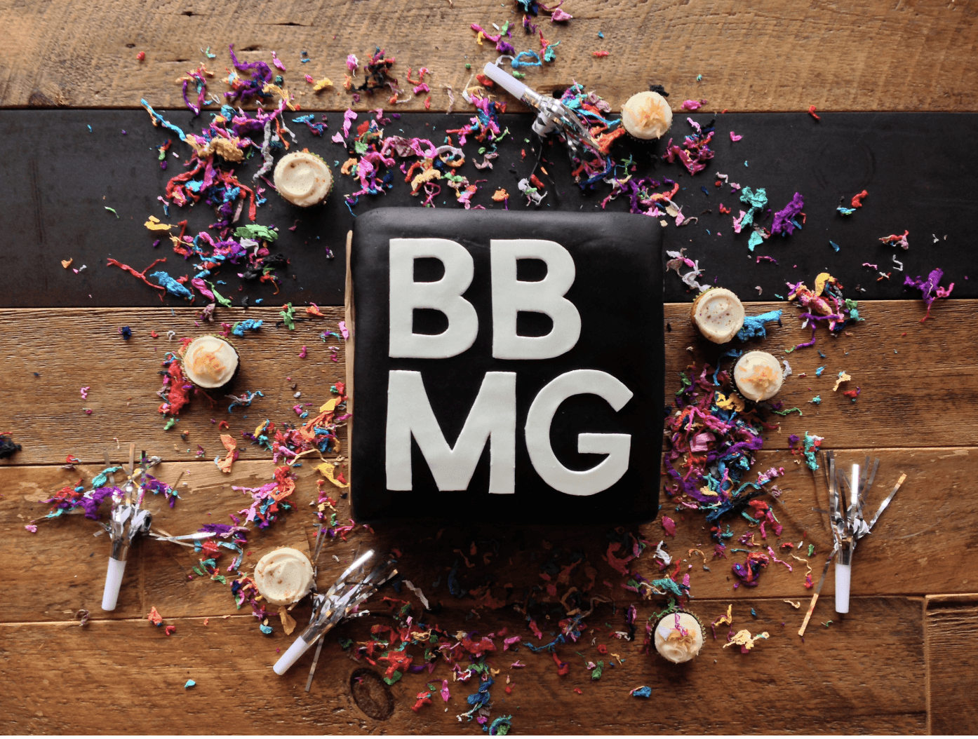
The original BBMG mark, affectionately known as "the bug," was formed by flipping two B's back to back (one for each principal's last name). The new identity began somewhere more fundamental: a single line. That line became a frame. The frame a square. The square a cube — a form that speaks to the dimensionality and rigor BBMG brings to every engagement.
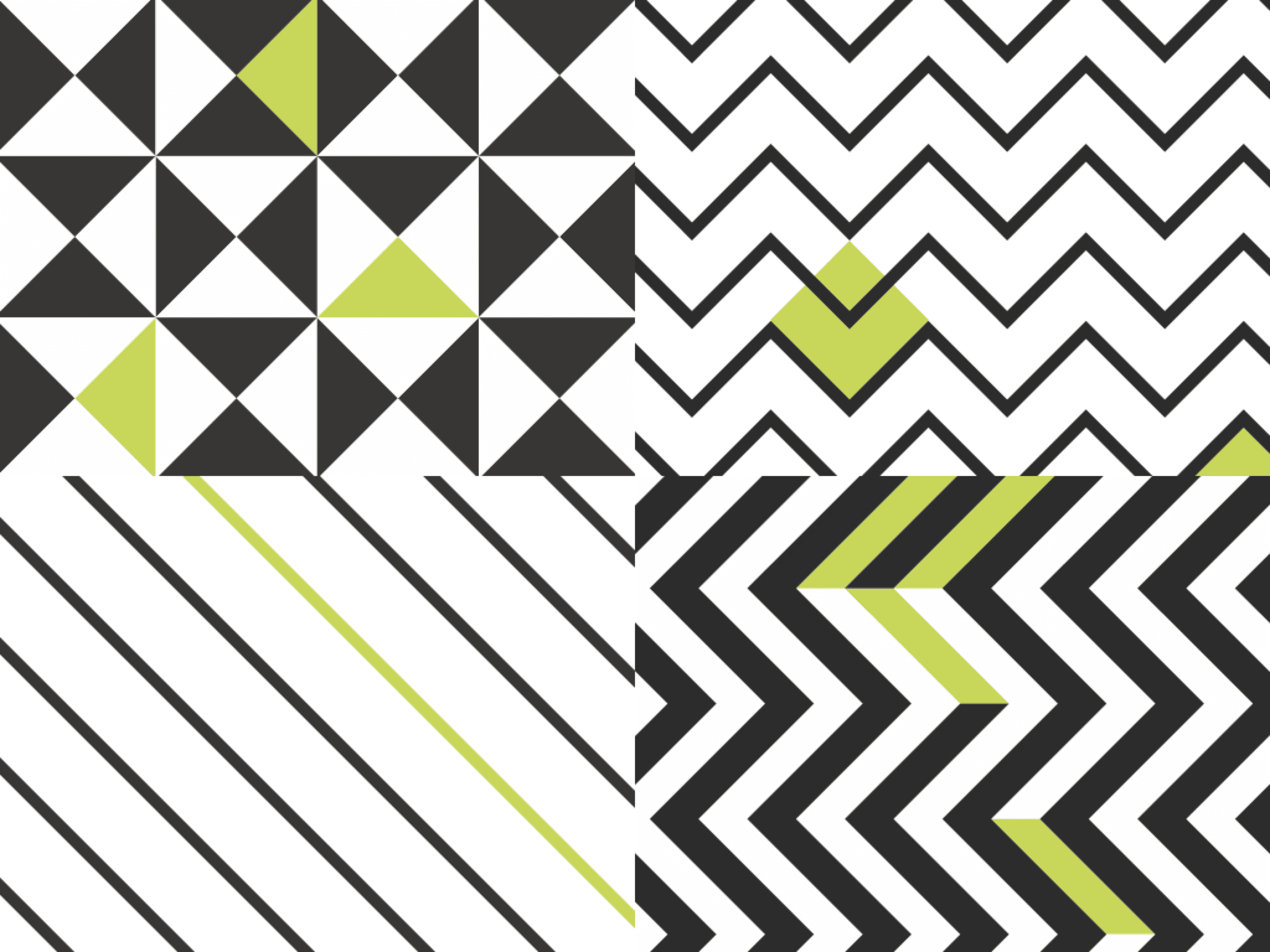
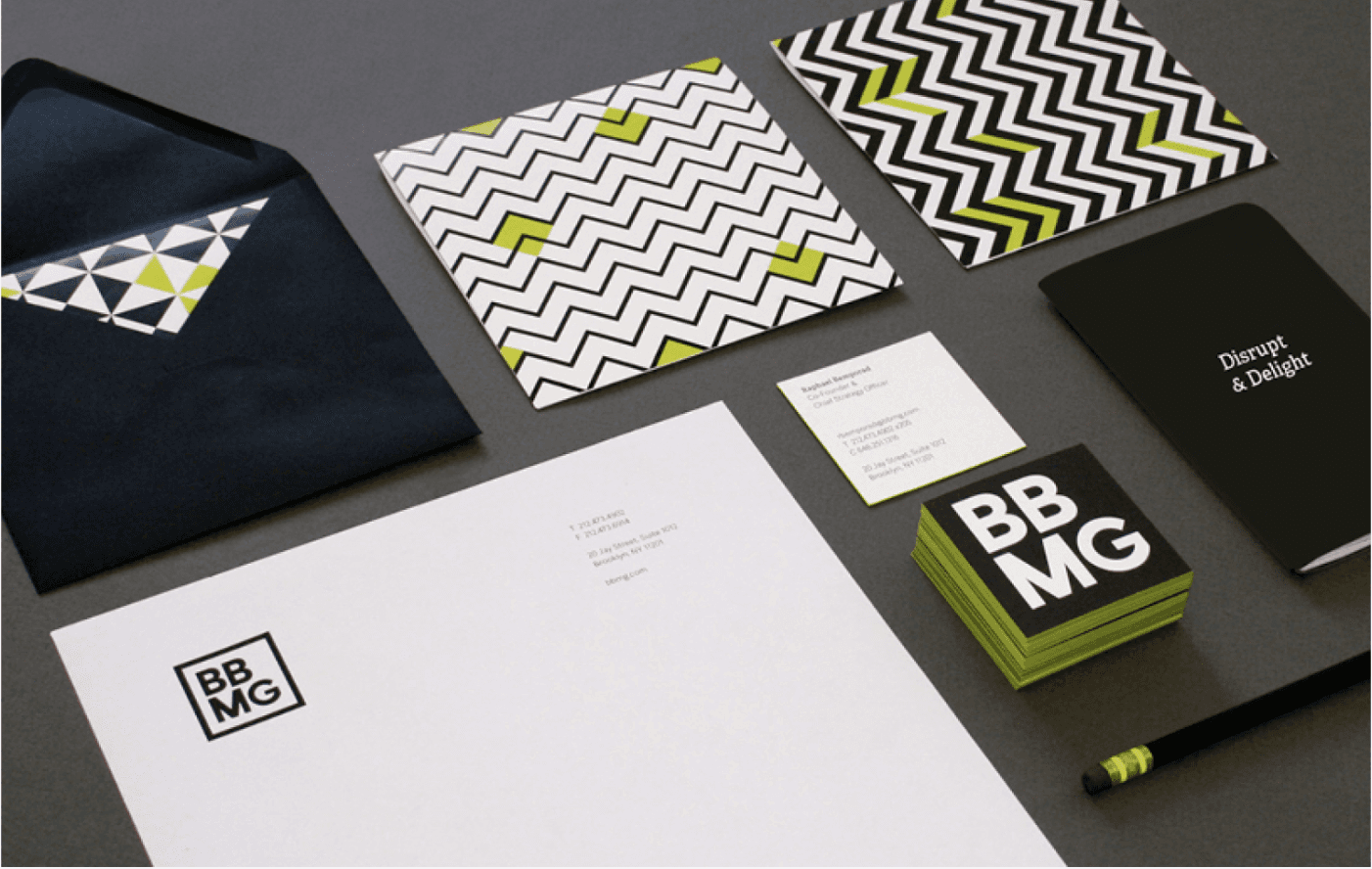
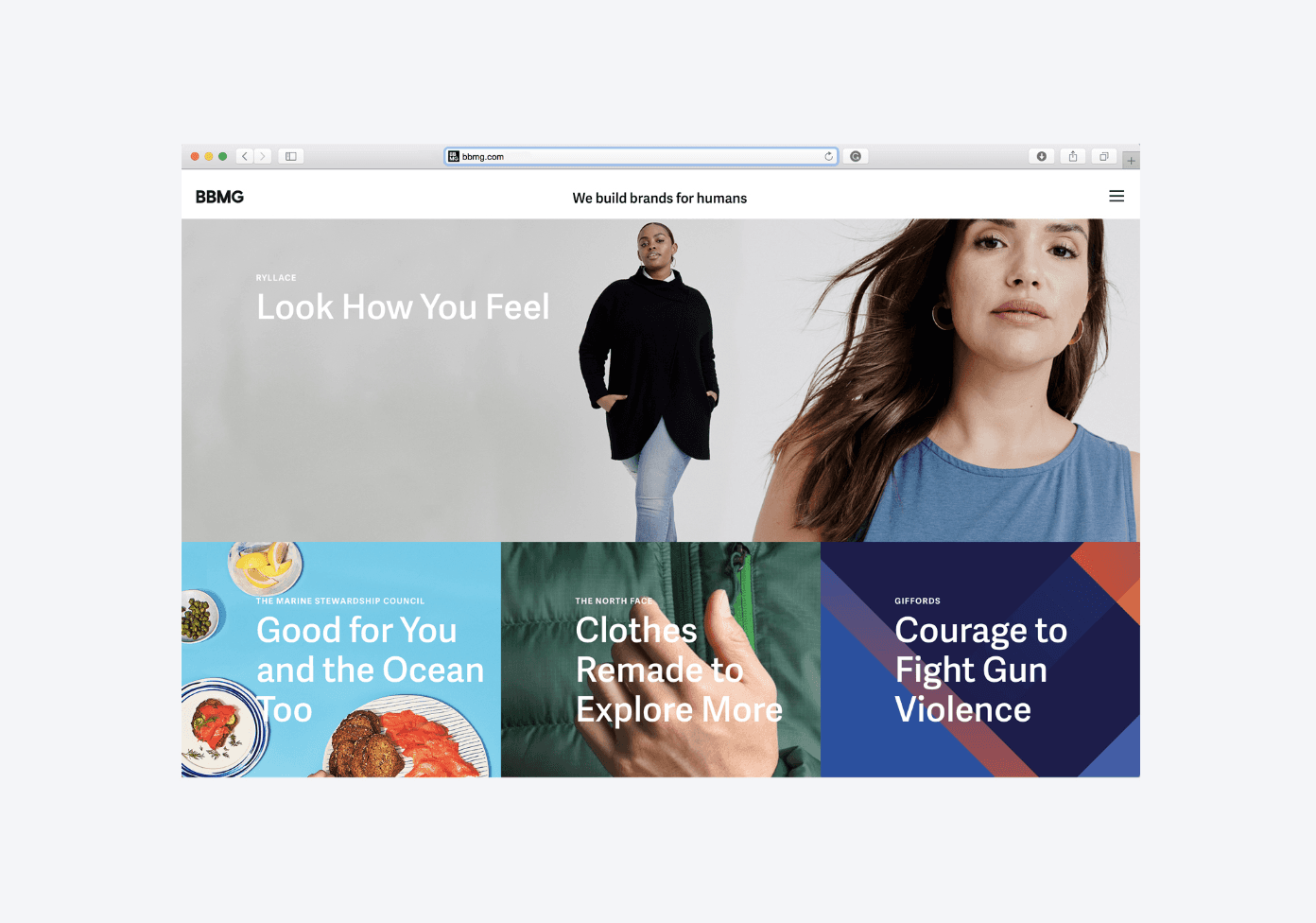
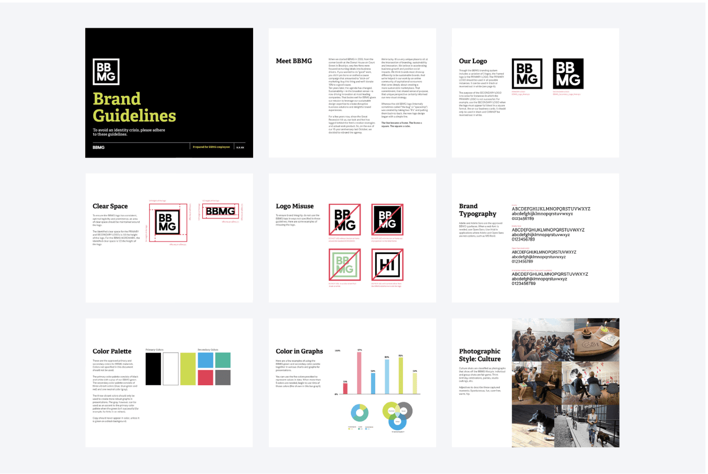
We refreshed the identity system across every touchpoint: stationery, environmental design, web, internal templates and brand guidelines. The color palette retained BBMG's signature green while upgrading the supporting palette to a more sophisticated black. Typography became cleaner and more confident.
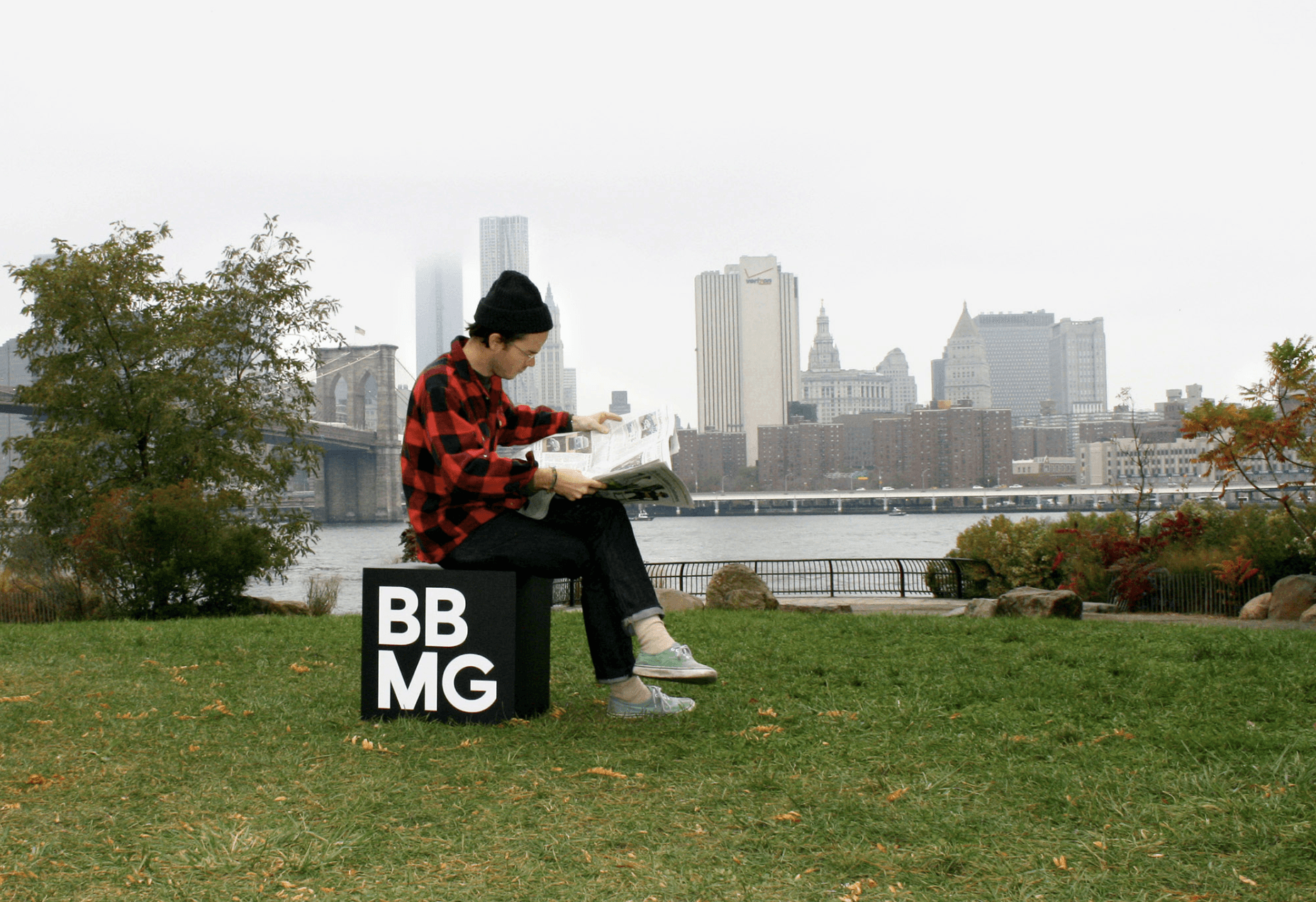
The most memorable expressions of the new brand weren't on screen — they were on the street. Like the gnome in "Amélie," BBMG's cube and its frame showed up in randomly delightful places across the Dumbo neighborhood, turning the logo concept into a lived experience, a place people could step into and photograph, embodying the brand's belief that good ideas should take up real space in the world.
Squeaky Like a New Pair of Shoes
"You know the old adage about the shoe cobbler's children? It was a bit like that. Our 10th anniversary was approaching and we realized, 'Oh, my. Our brand needs a new pair of shoes.'"
—Mitch Baranowski, Co-founder, BBMG
Other Projects

"Hello Wonderful"
Branding Rodale's first foray into wellness e-commerce

"You Should Getaround More Often"
Launching the nation's first car-sharing service
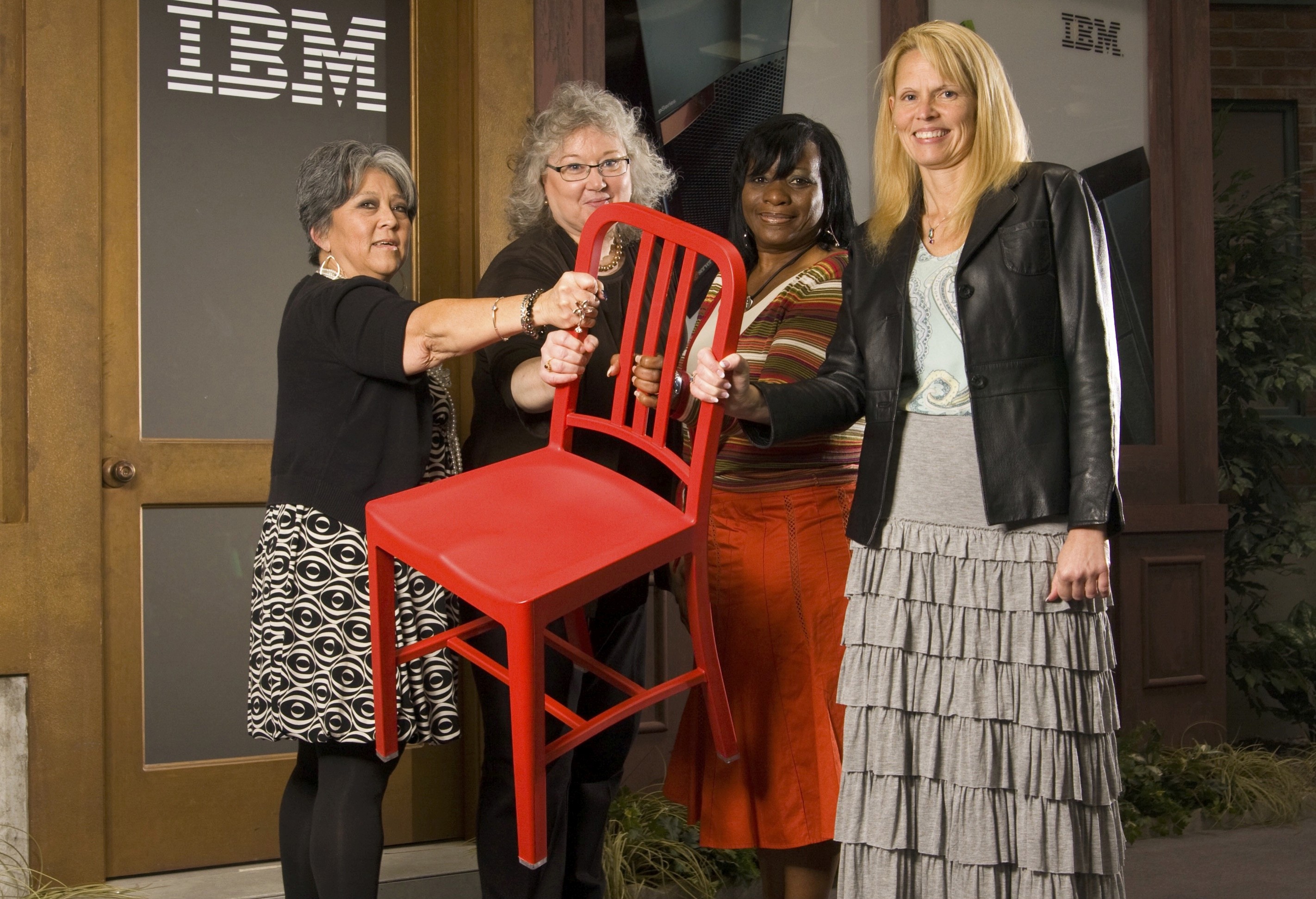
"Sit With Me"
Changing the conversation about women in information technology
Giving Millennials More of What Matters
Creating Target's first purpose-driven platform for unifying $1B of "better" products
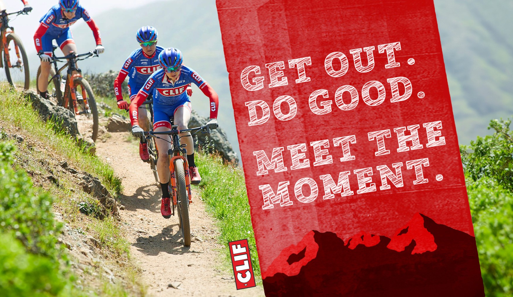
"Meet the Moment"
Creating a new brand platform for CLIF BAR to drive consistency and growth
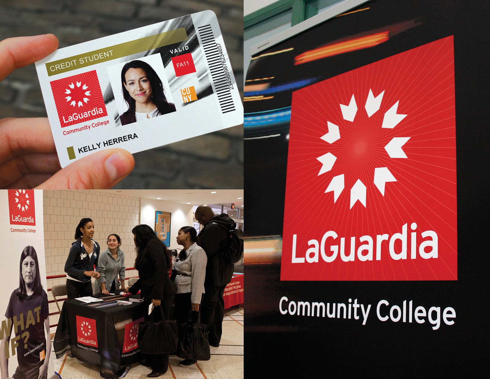
"Dare to Do More"
Branding the world's most diverse community college

Introducing Billy Galactic
Naming and positioning a new VR studio
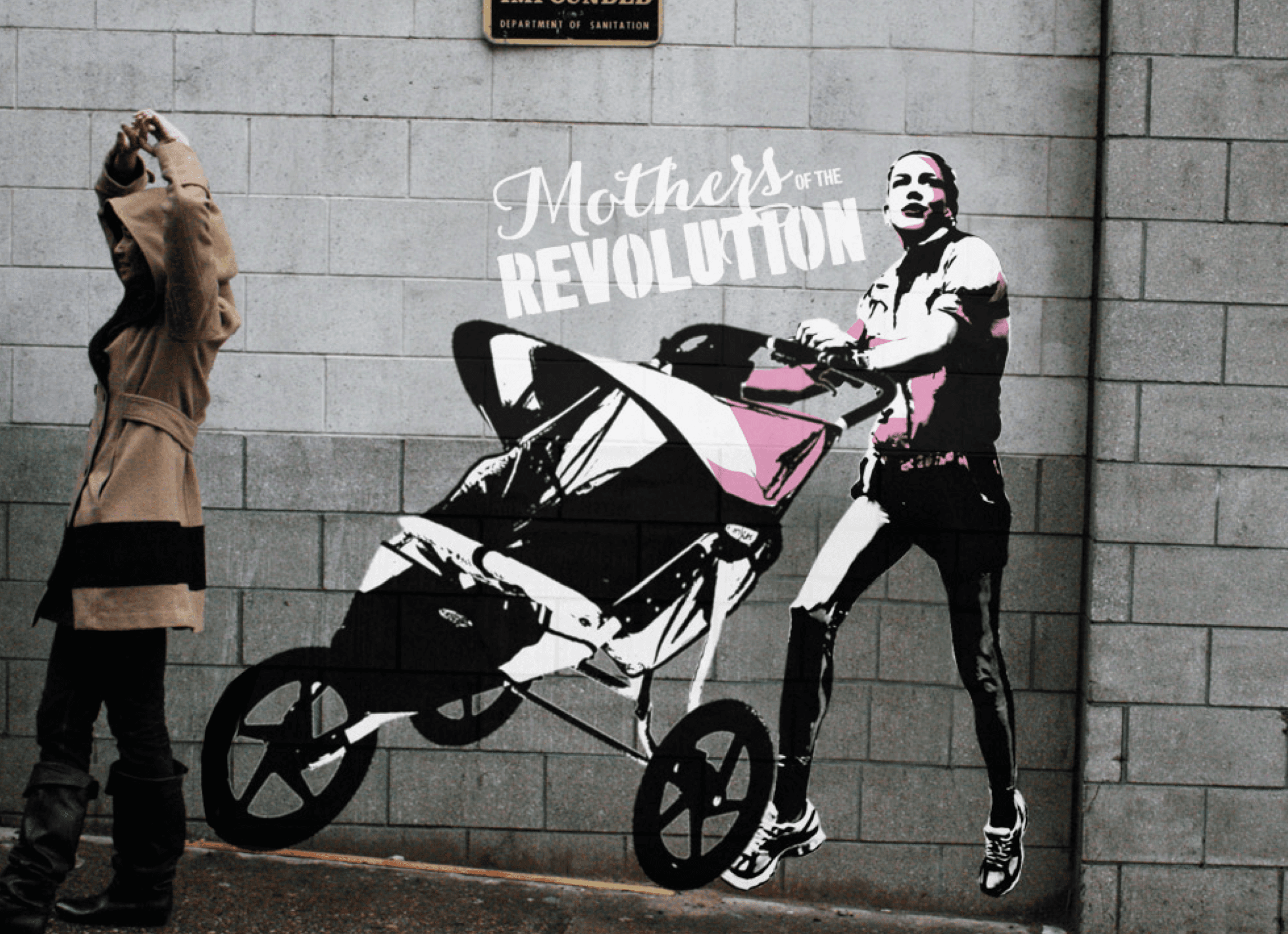
"Mothers of the Revolution"
Creating a movement brand for Breastcancer.org
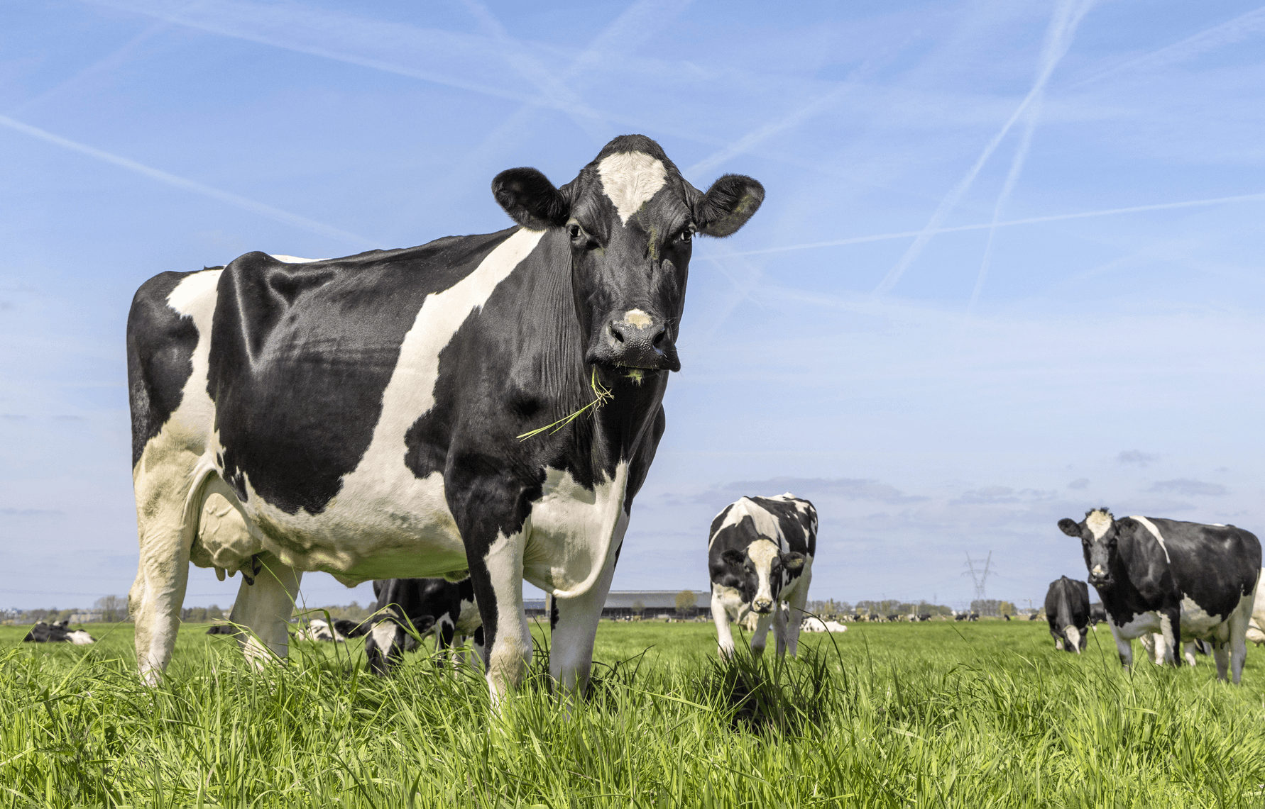
"Must Be the Milk"
Celebrating dairy as pride of place
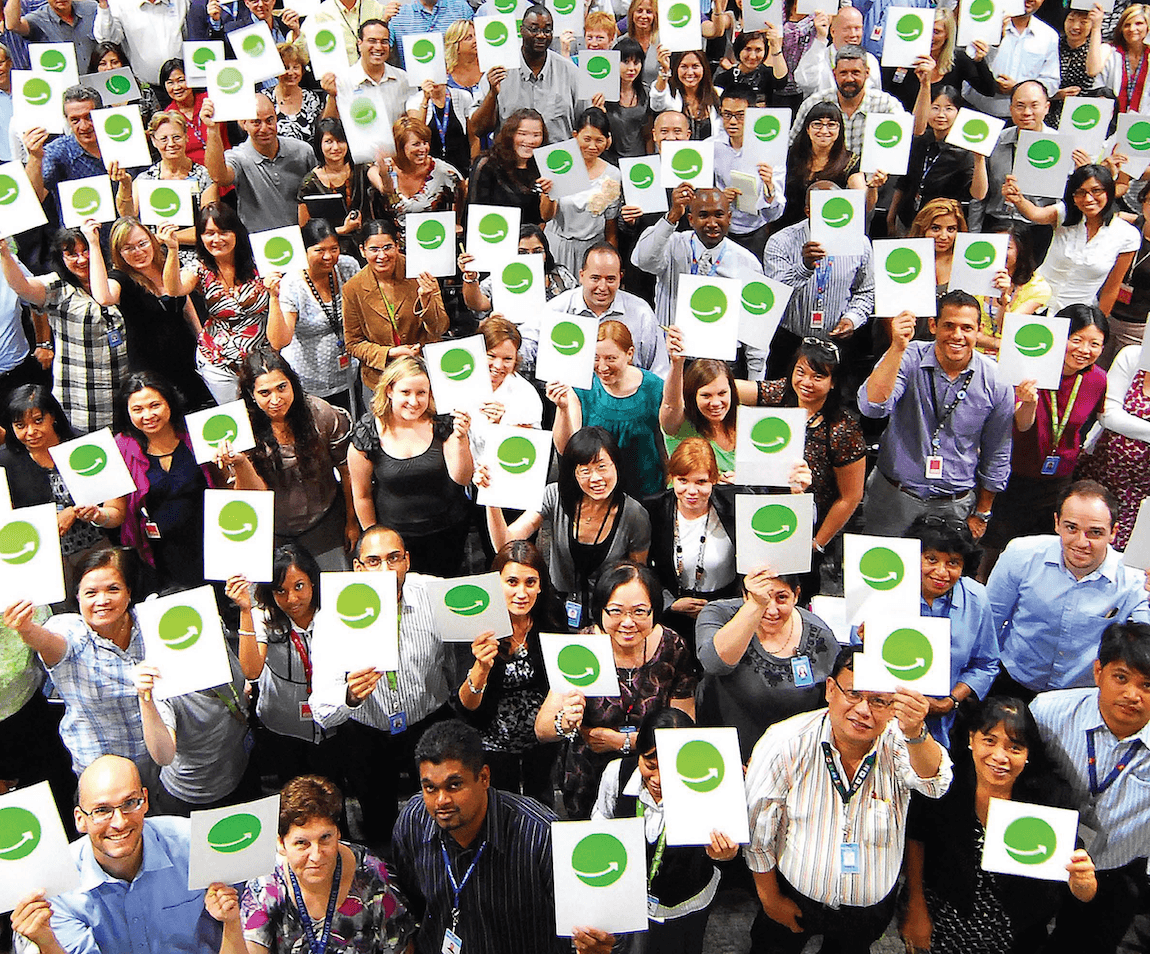
What's Your Sustainability Plan?
Inspiring 2.2 million Walmart employees to live cleaner and greener
"Give Back to Blue"
Celebrating a decade of 1% for the Planet